
Responsive Design
How can we help students and young adults feel more certain about their chosen career paths and have confidence in their decisions to pursue them?

Role
UX Designer
UX Researcher
UI Designer
Methods & Tools
Figma, Unsplashed, Figjam, Invision, Google Sheets, Google Documents, Prototyping, Branding, Color Injection, Sketching, Wireframing, Prototyping
OVERVIEW
Background
I created a responsive marketing website for my PathFinder app. I will present the app in both desktop and mobile formats. This provides an excellent opportunity to showcase the different features and components of PathFinder. The responsive marketing website will be another medium that I can use to interact with users.
PROCESS & ITERATION
Low-Fidelity Wireframes
The wireframes I created are both consistent with top navigation with the logo. There's a slogan message with an image to capture the user’s attention. Clear CTA included.
Features, programs, and testimonials are included with image placeholders. There will be carousels in the last 2 sections so users can be excited to explore the different options and opinions
Desktop
Mobile


This content flow diagram shows how each section will be laid out. The landing page will be the main focus of importance that will highlight PathFinder. As the user scrolls down, each section will have about the same amount of content that will showcase features and aspects of PathFinder. The content flow will apply to both desktop and mobile equally.
Content Flow Diagram
Desktop
Mobile


DESKTOP ITERATION 1
USER TEST AND REDESIGN
Peer Review Critique
I began to conduct some reviews and critiques from our peers with our high-fidelity prototypes. We asked around 2-3 peers to give us feedback on what can be improved to enhance the different elements and components of each version of the website.
Prioritization Matrix
SOLUTION
SOLUTION
SOLUTION
Based on the constructive feedback I received I will now integrate possible solutions into a priority matrix.

Design Improvements (Adjusting Logo, Buttons & Colors)
Based on user feedback, I adjusted the logo to be on the same line next to the name. I also removed buttons from the top navigation except for CTA to avoid confusion for users. I also added color to the background as the white space felt too empty for users. It was apparent that users felt overwhelmed with the amount of text that can be cut and shortened. I also increased the size of the header and bolded it to indicate the benefit to users. I also centered most of the headers too so that they will be appealing to users.


Timeline & Mockup Enhancements
I changed the mockups to elevate and enhance the experience as users found the previous version to be bland and simple. I decided to change the timeline graphic into a clearer scrolling animation as the previous version was overwhelming and confusing. I also added numbered sections on the timeline to show a sneak peek at the main function of PathFinder.
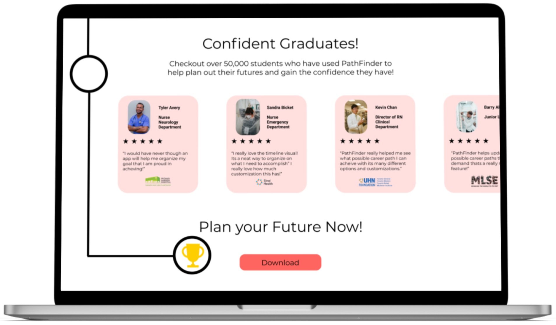
I increased the sizing of the carousel cards so that they can be easily readable for users. I removed the rating stars graphic as it felt overwhelming for users. I increased the size of the logo and profile images as users felt it was too small.

Review Section Adjustment
FINAL ITERATION

Here are the final revised desktop and mobile versions of the prototype. Mobile went through the same changes but made some different sizing and placement adjustments.


Click here for the desktop prototype .
MOBILE ITERATION 1
Click here for the mobile prototype.
CONCLUSION
Key Learnings
A marketing website is important and creative for the storyteller the brand and the message the digital producing is sending to its users. It's about telling a compelling story with the digital solution rather than selling a product.
Cool animations and minimalistic design are some of the ways to enhance the user experience but only if it makes sense and is necessary to do so!
Next Steps
Integrate more animations and flows with different areas of the website that users can explore.
Create a better scrolling animation experience.
Integrate more sections with new flows of the app that might be considered in its next phase.