
How might we help students feel more certain about their chosen career paths and have confidence in their decisions to pursue them?
Career Management Platform

Project Role
UX Designer
UX Researcher
UI Designer
Methods & Tools
Figma, Figjam, Unsplashed, Google Scholar, Dribble, Invision, Google Slides, Google Documents, Google Sheets, Sketching, User Testing & Interviews, Secondary Research, Wireframing, Moodboards, Affinity Mapping
OVERVIEW
This capstone project was completed during my 12-week studies at the Brainstation UX Design BootCamp. I researched and designed a solution to help generate possible career paths for high school students based on their skills, preferences, and education history. This case study demonstrates the design process from discovering to delivering.
Background
Students are unconfident with their career decisions due to the lack of guidance, counseling, and support.
Problem Space
Nearly 51% of students are unconfident with their career path decisions. Students often underutilize career services due to the lack of quality in the support that is offered. As a result, students are often lost with their career directions.
Statistics
PRIMARY RESEARCH
Nearly 49% of post-graduates have made significant career transformations.
In 2022, about 50% of Americans were planning to make SIGNIFICANT CAREER CHANGES because of Covid-19 related reasons.
SECONDARY RESEARCH
Five interviews were conducted in order to gather more insights regarding the problem space. This is the required criteria for eligible participants for the interview:
High school or university students and post graduates ages 18-26 who are unsure about their future career plans or are going through a career change.
Interviews
Common Themes

How might we help students feel more certain about their chosen career paths and have confidence in their decisions to pursue them?
Reframing Design the Question
PROCESS & ITERATION
Persona

“As a High-school student, I want to be able to have a roadmap of all appropriate and possible career path options, so that I can confidently manage my decisions.”
Focused Core Epic
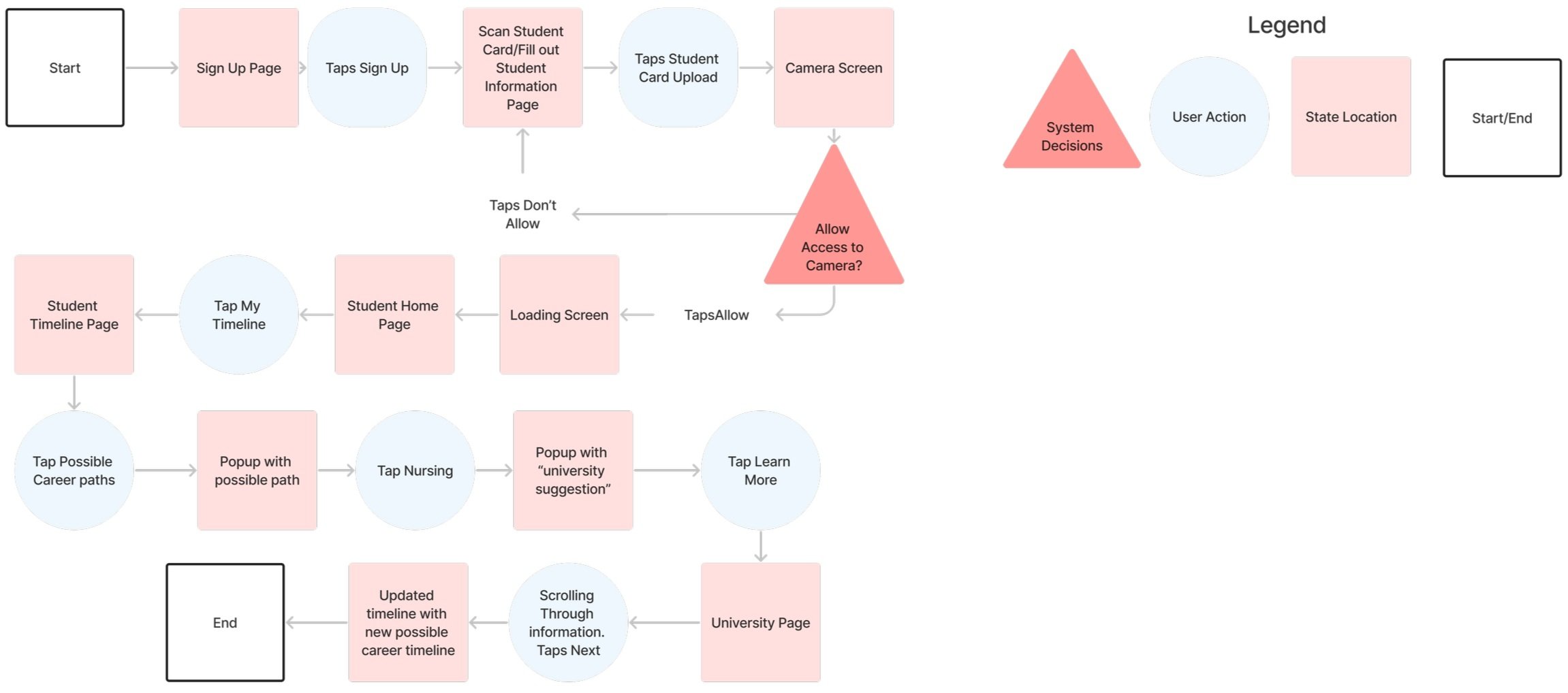
This task flow was created to give a visual representation of how a possible digital solution can help with Jennie’s pain point of feeling unconfident with her career decisions.
Chosen Epic: Planning Career Path.
User Task: Generate a career path that fits the user’s preferences.
Task Flow
Solution Sketches
Wireframing
There were major usability problems throughout each step of the task flow except for the onboarding process that could have more detailed improvement.

Prioritization Matrix
I began applying the necessary revisions based on the findings and analysis of the prioritization matrix. It was apparent that adding more detail and context to the registering process pages was important. There were many users that were left confused without much of a tutorial on what they are signing up for. I decided to change the size of the buttons in order to let users know where to locate the CTA better.
SOLUTION


SOLUTION
I discovered many users were very confused with the timeline being introduced so quickly without a proper detailed step-by-step onboarding or even filtering process. Provided more various options rather than a linear process that limits choice.

It was apparent that the timeline experience was confusing for users. I decided to upgrade the aesthetic of the overall timeline as it will be easily readable and understandable. Creating separate pages indicating success/error in order for the user to understand the purpose of what they are interacting with.


Onboarding Questions
SOLUTION
Updating & Refining the Timeline Experience

Here is the second and final round of user testing before I implement some branding to turn my digital solution into a high-fidelity prototype. I discovered from my user testing findings that users unanimously agree that they had trouble tailoring their search and navigating filters.
USER TEST ROUND 2
SOLUTION

Prioritization Matrix Round 2
Removing the Continue Buttons to Speed Up Process

I began integrating the final rounds of revisions based on the final round of user testing feedback. Many users felt that the continue button was an unnecessary extra step after every onboarding question. I removed the continue button and did not overwhelm users with the number of buttons needing to click.


I found that users felt lost on where to locate the filter button while trying to set preferences. Users also were wondering if there were more pages other than the top results to click on. As a solution, I made the filter CTA button more obvious and visible and I added more pages to indicate that there’s more to search for if users wish to continue.
SOLUTION

Filtering based on Budget and Interests

Uploading Student Info
Timeline & Customization
Students are able to customize and add any program they wish to pursue. Based on filters and the student profile, students will be able to see which programs are appropriate based on their knowledge and interests. Once the student picks the appropriate program that interests them, they can visually see what are the steps to reach the goal and the steps they have already achieved. They can deicde to pick another program to pursue if they wish to see other fields as well.
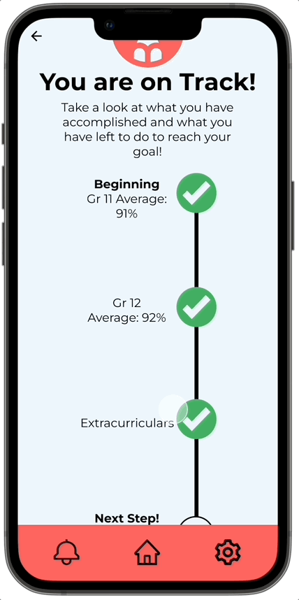
Accessing Student Timeline
Filters & Pages

SOLUTION
Progressive Disclosure With Filter Pages & Minor Adjustments
Users were very confused if the budget slider was a continuation question from living residence. As a solution, I used progressive disclosure and a separate budget slider on a separate screen to avoid confusion. Some users wanted the flexibility of skipping as there wasn’t any option to do so. I also adjusted the coloring and used progressive disclosure in order to avoid which button is the main CTA.
Adding Program to Timeline


BRANDING
I chose the name PathFinder since my capstone idea is to find and discover different paths for students to confidently pursue a career. I began exploring different wordmarks by sketching and bringing different ideas into Figma. Here are some of the iterations that I have chosen. The wordmark will follow a Sans Serif Montserrat typeface style.
Wordmark

I chose this wordmark since it represents the entire concept of the digital solution and problem space. The broken parts of the word mark have a symbolic meaning of how students are missing a few parts towards their path to accomplish their goal. The pencil logo was included in a wordmark iteration but I felt it made more sense as a logo. It signifies a youthful and innovative feeling with the overall image.

Wordmark & Logo
This is the breakdown of the different color iterations that I experimented with based on the brand’s color pallette.

Wordmark & Logo Color Iterations


Color Exploration/Palette

After solidifying the branding process with the wordmark and logo, I began the process of extracting color from my mood board and choosing the appropriate color palette. This is the color breakdown for the color injection process.

The final design encapsulates the 3 main areas that help students with filtering their results based on their preferences & grades, tailoring their experience during onboarding, and their own customizable timeline.
Filtering Results Based on Preferences & Grades

Filtering based on Distance & type
Onboarding & Uploading Student Information

FINAL SOLUTION
High-Fidelity Prototype

Uploaded Grades
Value Proposition
I learned that students will be more likely to gain additional confidence and passion when they are given more career support earlier on. Students really need more honest and realistic information about career paths so that they will not feel regretful or unsure about their decisions.
I discovered that I have to design and ideate with the intention that it will support the user. I also learned that designing for problem spaces where it’s an actual underlying issue will create a lot of impacts and meaning for users that can help support their daily lives.
Filtering & Onboarding: Students are able to filter their search based on preferences, skills, grades, and courses they have taken. Their student information will be automatically uploaded so they can have a synchronized experience.
Timeline: Students and users are able to visualize and see their intended timeline and even update them based on preferences or changes to their student records. Users are able to track what they accomplished, what’s their next step and see what’s their end goal.
Research: PathFinder is able to do all the research for you in the palm of your hand. Students will have access to all information they wish to see.
Create more flows in the digital solution. Include a notification panel that will inform users about high-demand careers based on news. Create more customization options with the student timeline.
Create a marketing campaign (conduct A/B testing).
Creating a campaign to test out the prototype and gain valuable insight and feedback from A/B testing.
Create a Responsive Marketing website. Showcasing different features and components from a business and marketing perspective.
Next Steps
64% of students met with a career counsellor only ONCE in their schooling.
51% of students are UNCONFIDENT in their career path decisions.
44% of students DON’T KNOW what they want to do for their careers.
Click here to view user stories


USER TEST ROUND 1
Click here to view the prototype.
Click here to view usability results.
Expanding the Onboarding Process and Resizing Buttons
Integrating Filtering Process with the Timeline.
Click here to view the prototype.
Click here to view usability results.
Click here to view the prototype.
Click here to view the prototype.
CONCLUSION