Improving Donation Process
How might we help Environmental Defense Fund express their value, and inspire people to take action in order to drive positive change?
Project Role
UX Designer
Researcher
Prototyper
Usability Testing
Stitcher
Methods & Tools
Figma, Figjam, Slack, Google Drive, Sketching, Wireframing, Branding
My group and I created a redesign of the Environmental Defence Fund (EDF) during my time at the Brainstation Bootcamp. We worked collaboratively during this design sprint to research, analyze and design with intention. Our goal is to evaluate the environmental defense fund’s webpage to see how we can strengthen their digital experience to enhance users’ understanding of the organization and help raise their donations. Our group had 1 week to complete this design sprint and present an elevator pitch.
OVERVIEW
Background
How might we help Environmental Defense Fund express their value, and inspire people to take action in order to drive positive change?
Problem Space
EDF has an overwhelming amount of information spread across many avenues and it is difficult to digest. Accomplishing the task of understanding is difficult.
Objective: Find out more information on the organization and its users
What is working?
What could be improved?
What could be enhanced?
Learn about the market surrounding the problem space
PRIMARY & SECONDARY RESEARCH
Secondary Research
While EDF has received grants from at least 30 organizations, a big majority of members give less than $100. We also found out that the majority of younger users will be inclined to donate if the functionality and UX design of the website is displayed appropriately.
Statistics
When Millennials check a nonprofit’s website, they care about what and how an organization operates. In other words: we want to see tangible results.
Demographics
This is the Current state of EDF through this journey map of the user! So the user hears about EDF from a friend and decides to learn more about the organization and possibly donate. But he is having trouble finding that information. The information is just randomly ordered as it just everywhere but he finally stumbles upon it after many clicks and reads and decides to donate. He discovers it's just a weird layout and not much background information about how the donation will impact and feels lost after donating.
PROCESS & ITERATION
Current State Journey Map
EDF Current State
Persona
Meet Jeff. He's a 35-year-old software engineer. He lives close to nature and cares about the environment. His Goals include: making a difference in different causes while trying to understand what the impacts are. His pain point is navigating websites is complex and feels like there is a lack of transparency.
How Might We
How might we support individuals who care about the environment to understand the impact of their donation so they feel empowered and compelled about their contribution?
Since this is an established brand we wanted to maintain elements such as colors, fonts, and visual identity but we also wanted to add impactful images and white space for ease of scanning information and for emotional connection. The inspiration board contains elements that are contrasting in nature. A push and pull between movement and static imagery emphasize the necessity of the cause with moments to pause to think and act.
EDF Moodboard
After establishing a mood direction we created exploratory sketches. We wanted to maintain the continuity of the brand and not create any changes that felt like a big departure from the main pages.
Exploratory Sketches
And we arrived at our final solution sketch. The homepage and category climate page are the areas in which we agreed to have a very simple and organized order of information and layout. For the donation page, we wanted to break up the experience into smaller steps so that it will not seem overwhelming to the user.
Solution Sketches
This is the future state solution. Jeff learns about the organization and instantly finds what he is looking for about climate change. He reads more about the issue and a proper CTA to donate, which prompts him to take action. He feels more empowered.
Future State
USABILITY RESULTS
Prioritization Matrix
Here we organized our feedback into the design prioritization matrix to prioritize findings through effort and value.
Design Improvements: Hero Adjustment
Design Improvements: Fixing Headers
Design Improvements: Rounding Buttons
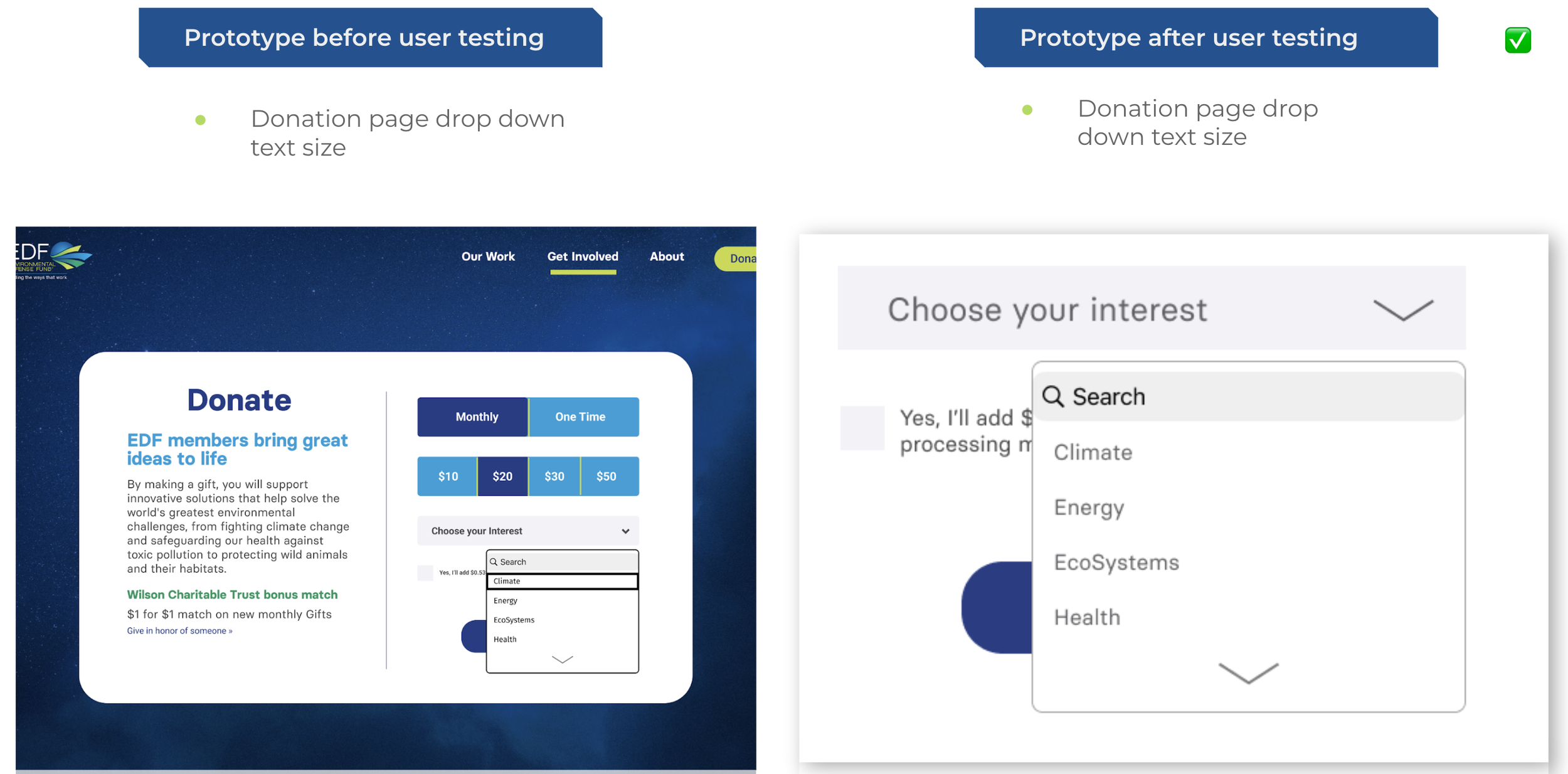
Design Improvements: Text Size
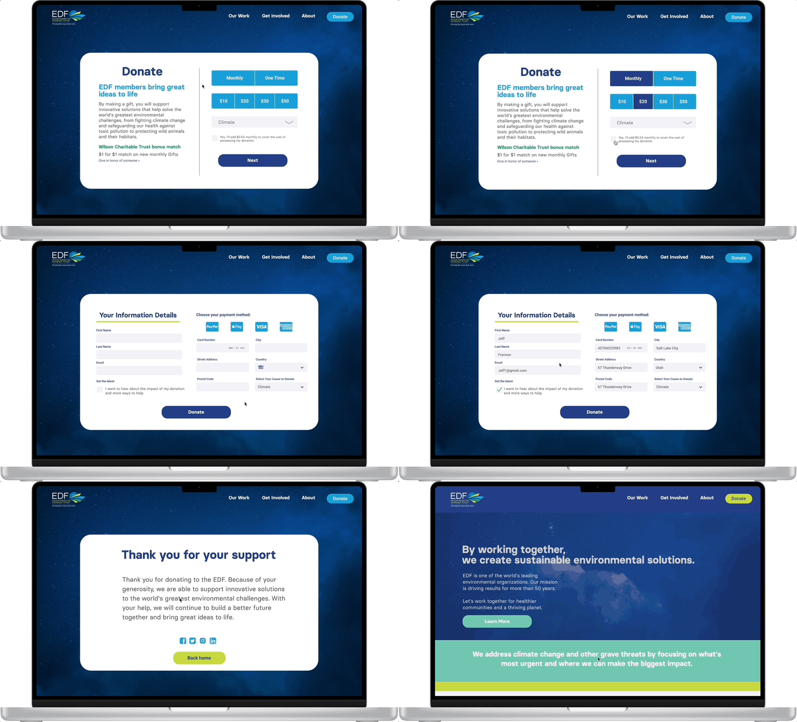
This is our final high-fidelity prototype. All design feedback has been implemented. The 3 main areas of focus are tailoring the experience to the user, providing detailed information & simple navigation and a quick seamless donating process.
FINAL REDESIGN PROTOTYPE
Selecting User Preference
Clicking Drop Down Navigation
Making a Donation
Click here for a the high-fidelity prototype redesign.
CONCLUSION
Next Steps
Integrate user testing findings into a revised high-fidelity digital solution that speaks to the pain points of their experience. Prototype a mobile web version of the solution. Conduct 5 more user testing after revisions have been made.
Click here for a full breakdown of interviews and usability results.


